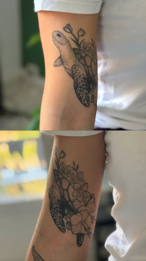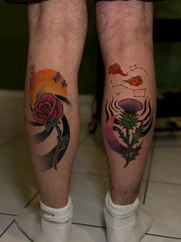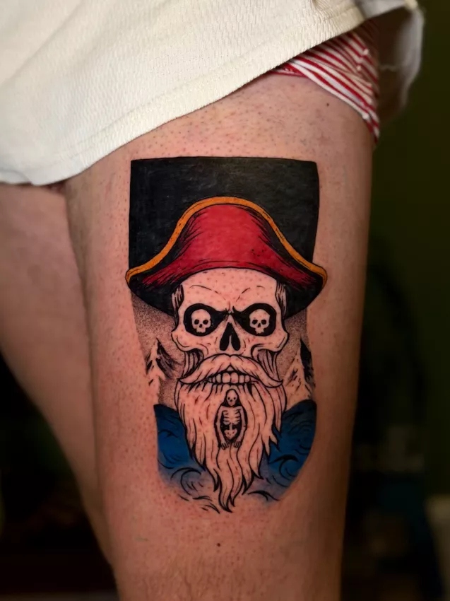
There's a funny moment with watercolor projects. The person shows me a very soft, light, almost transparent image, and in their head the tattoo is already floating on the skin like a watercolor stain on paper. Except skin isn't paper. It moves, it tans, it heals, it keeps some colors and eats others like it has its own little appetite.
A watercolor tattoo can be stunning. Truly. But it's a style that needs an honest conversation before the needle comes out. If you want a tiny pastel blur without outlines, you also have to accept the uncomfortable question: what will this look like in five years?
What is a watercolor tattoo, really?
A watercolor tattoo, also called a watercolor style tattoo, imitates the effect of watercolor painting: soft diffused spots, blended colors, sometimes no outlines, gentle transitions. The point isn't to fill a shape like in a forgotten elementary-school coloring book. The point is to create an impression of movement.
The style works well with flowers, animals, butterflies, abstract shapes, silhouettes, cosmic compositions. It can also accompany a fine-line motif to give it life. If you're torn between discreet and colorful, my article on minimalist tattoos can help you understand what a small piece can actually hold.
The trap is believing that watercolor means "less tattoo." In reality, you often have to build the design with enough pigment to stay visible after healing. Skin always swallows part of the subtlety. It doesn't ask for your opinion, obviously.
Why this style is more fragile
All tattoos age. Every single one. Lines get a little thicker, pigments lose intensity, details simplify. On a watercolor tattoo, this aging shows faster if the design relies only on very light shades.
A study on pigment photostability reminds us that color degradation can contribute to tattoo fading over time: Photostability and breakdown products of pigments currently used in tattoo inks. Simple version: sun, time, skin, pigment chemistry. Everything plays a role.
Pale yellows, soft pinks, and light blues can lose power. It's not a disaster if the composition has structure. It's trickier if everything rests on a pastel blur with no contrast.
Should you use black outlines?
Not always. But often, a little structure helps. A black outline, even partial, gives the tattoo a skeleton. It lets the eye understand the motif once the colors have faded.
On a butterfly, for example, you can keep the wings in watercolor but add a few lines to preserve readability. If that motif interests you, the guide on butterfly tattoos gives several ways to avoid the too-fragile Pinterest look.
You can also use contrast without a full outline: darker masses, shadows, dots, textures, areas of blank skin. The goal isn't to betray watercolor. The goal is for your tattoo to still exist in a few years.
Good placements
Areas with little friction are preferable. Upper arm, shoulder blade, thigh, calf, forearm if you protect it well from the sun. Very exposed or very mobile areas can fade faster: hands, fingers, feet, neck, creases.
Size matters too. A watercolor tattoo that's too small loses its interest. Blots, transitions, and breathing room need space. A two-centimeter piece with five colors is rarely a good idea.
If you want something small, simplify: one strong color, a readable shape, few details. Small and blurry isn't delicate. It's just small and blurry.
Aftercare: the sun is your worst coworker
Healing should be clean, simple, without extra layers of cream. The basic advice is on our care page, and they matter even more for color. No baths, no pools, no sun during healing.
After healing, SPF 50 sun protection whenever the tattoo is exposed. Not just the first year. Always. A light color that you bake in the sun every summer is going to lose intensity, no question.
Aftercare isn't magic. It doesn't stop time. But it avoids speeding things up stupidly.
Who is this a good idea for?
Watercolor tattoos are a good idea if you accept their living side. They can be soft, luminous, emotional, very personal. They work well when the composition is designed for skin, not just copied from an illustration.
They're less suited if you want maximum sharpness for twenty years without touch-ups. In that case, look at more structured styles like traditional, neo-traditional, or certain graphic compositions.
What I'd keep in mind
- A watercolor tattoo needs enough contrast to age properly.
- Light colors are more sensitive to fading.
- A partial outline or graphic structure helps a lot.
- Sun and friction are the real enemies.
- Recommended cover: a 1200x630 detail of watercolor spots on skin, natural light, neutral background.
Watercolor is a good idea if you want something alive. It's not a good idea if you want an eternal screenshot. The tattoo will move with you. That's a flaw only if nobody told you before.