The other day, a woman came in with an A4 sheet covered in printed fonts. She had spent three days on Canva testing typefaces for her tattoo. Three days hesitating between cursive, sans-serif, and gothic. I looked at her, saw the panic in her eyes, and said: “OK, we’re going to take the time, because this is the most annoying tattoo to do properly.”
Why lettering is tricky
Lettering tattoos look simple. In reality, they are some of the hardest tattoos to execute. One straight line slightly off, one messy curve, one awkward space between letters — everyone sees it. And unlike a drawing, you cannot hide a mistake behind shading or detail.
Also, a spelling mistake on a lettering tattoo is the absolute disaster scenario. We have all seen “no ragret” and weird misspellings online. Do not become that example.
What I have learned from tattooing hundreds of letters: lettering is not just a font printed on paper. It is a composition that has to adapt to the curve of the body, the placement, the size, and long-term readability.
The main lettering styles
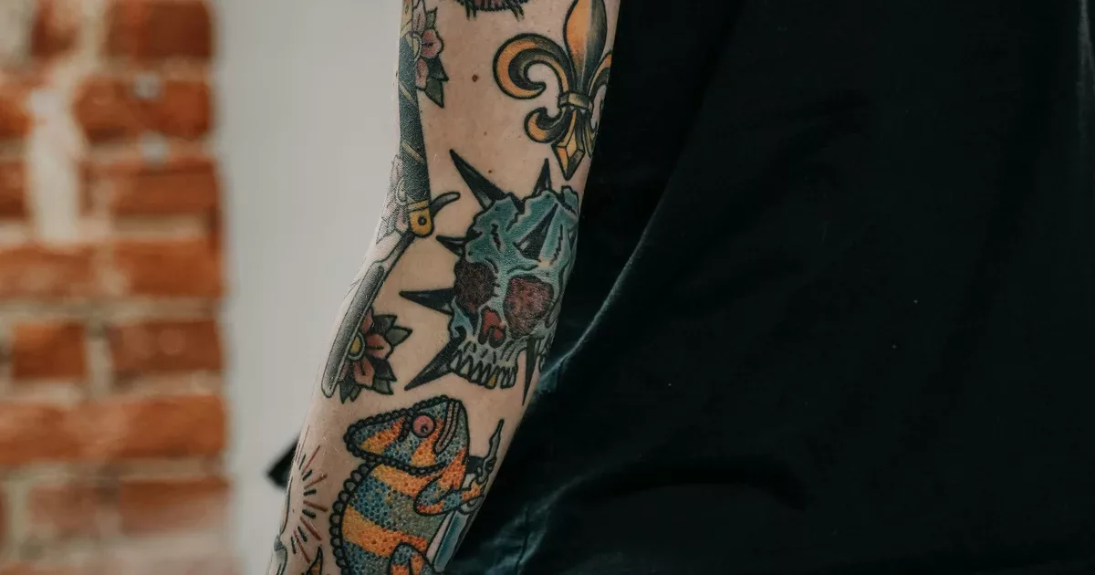
Old school / traditional
Bold fonts, thick lines, strong shading. This is sailor lettering, biker lettering, street tattoo lettering. Think “sailor” fonts or heavy gothic-style letters.
It ages very well, stays readable even at smaller sizes, and has real character.
Cursive / calligraphy
Handwritten-style lettering, with thick and thin strokes. It is one of the most requested styles, and one of the hardest to do well. Real calligraphy needs a trained hand — not just a tattoo artist copying a computer font.
Gothic / blackletter
Medieval, angular, impressive. Popular in metal culture, American traditional tattooing, and ornamental lettering. Very graphic, but often hard to read unless you get close.
Minimalist / fine line
Thin strokes, clean fonts, sans-serif. Modern, discreet, elegant. Perfect for short phrases, dates, and names. But be careful: thin lines spread over time. See our article about minimalist tattoos.
Chicano / letras
The lettering style rooted in California prison culture and Latino crews. Highly ornamental letters, complex shading, tears, religious elements. It is a full tattoo style in itself, with strong codes.
What size should a lettering tattoo be?
The number one mistake: going too small. A full sentence on the wrist in a fine font may look cute today, but in ten years it can become an unreadable black bar.
A rough rule: lettering should be visible from 2 meters away if you want it to stay readable for life.
- A date: at least 1.5 cm high
- A first name: at least 2 cm, 3 cm if the font is fine
- A sentence: choose a large enough area, not a tiny leftover space
- A fine font: go at least 30% bigger than what you first imagined
Where should you place lettering?
Flat areas are ideal: forearm, ribs, upper back, inner arm. Curved areas like the wrist or fingers distort letters, so the composition becomes harder.
Our article about writing tattoos goes deeper into placement constraints.
The checklist before getting lettering tattooed
- Check the spelling three times with someone who is not you
- Test the font at real size: print it and place it on the area
- Choose a specialist: lettering is a craft, and not every tattoo artist knows how to do calligraphy
- Think about aging: fine strokes expand, letter spacing closes up, loops can fill in. Our tattoo aging guide explains how to anticipate this.
- Avoid stretchy areas: stomach, lower belly, inner thigh. Letters can distort with time and weight changes.
Lettering is the least forgiving tattoo style. But when it is done well, it can be the most personal, the most intimate, the most direct. A sentence, a name, a date on the skin. Sometimes that is all you need to say.