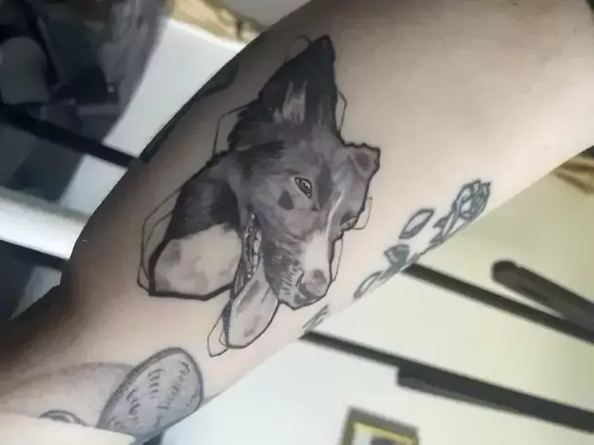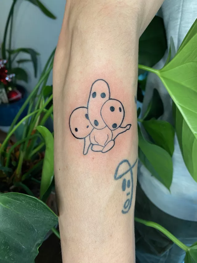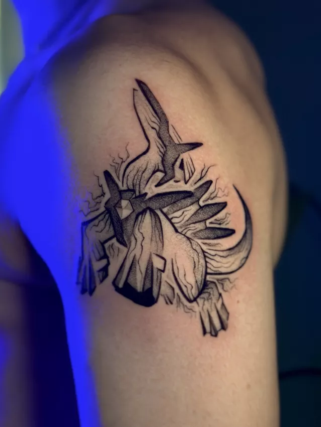
Blackwork has an honesty I really like. No timid gradient apologising for itself. No faint grey mumbling in a corner. Black. Shape. Contrast. Presence. Sometimes brutal, sometimes elegant, sometimes very minimal, sometimes massive. But it never pretends.
When someone comes to the studio wanting blackwork, there's often a different relationship to the body. Not just a small symbol placed somewhere. We're talking structure, impact, readability from a distance, rhythm. Even for a small piece.
In Grenoble, blackwork appeals to people who want graphic tattoos just as much as those after something stronger, more assertive. But you need to know when this style fits.
Blackwork Isn't Just "a Black Tattoo"
Technically, almost every tattoo uses black at some point. But blackwork makes it a real visual language.
Solid blacks, geometric shapes, abstract motifs, ornaments, contemporary tribal compositions, simplified engraving, graphic symbols, strong contrast, thick lines, negative space. Black isn't just a colour. It's the main material.
A blackwork tattoo is often more readable from a distance than a highly detailed one. It has presence. It can follow the body, accent a joint, frame an area, create visual balance.
But precisely because it's strong, it demands solid composition. A big black area badly placed can feel heavy. A graphic shape with no relationship to the body can look like an authoritative sticker. Black needs to be thought through.
When to Choose a Graphic Style
Blackwork is a good option if you want a tattoo that's readable, high-contrast, visually durable, with a strong identity.
It works well for abstract motifs, stylised personal symbols, engraving-inspired compositions, ornaments, geometric pieces, heavily simplified animals, dark botanical forms, partial cover-ups, or projects that need to keep their punch over time.
It's also interesting if you don't like tattoos that are too illustrative or too "pretty." Blackwork can be dry, raw, architectural. Not cold — but more direct.
Some people come with a desire they describe as "I want something dark but not gothic, graphic but not a logo, organic but not floral." Vague, yes. But it's often the start of a good blackwork project.
To learn how to better phrase this kind of request, read communicating your project to a tattoo artist.
Black Ages Well, But It Doesn't Forgive Everything
You often hear that blackwork ages better. Partly true. A high-contrast tattoo with legible shapes generally holds up well visually. Blacks stay more present than tiny details in pale grey.
But careful. Blackwork won't make a bad design better. It makes it more visible.
A poorly thought-out line, an unbalanced shape, a too-heavy composition, an uneven fill — everything shows. Black has that cruelty. It doesn't hide weak intent. It frames it.
Blackwork quality depends heavily on placement, proportions, density, and breathing room. Empty space is as important as filled space. Sometimes more.
A good blackwork artist in Grenoble needs to handle black, but also know where not to put it.
Placement Changes the Tattoo's Power
A blackwork piece on the forearm doesn't tell the same story as one on the calf, ribs, shoulder, or back. The body's shape becomes part of the design.
A graphic motif can follow a muscle, wrap around a joint, elongate an area, create tension. Or fall flat if placed without thinking.
The stencil is crucial. You don't just stick the design on and say "perfect." You look at movement, symmetry, distance, visibility. Sometimes you adjust. Sometimes you enlarge. Sometimes you move it.
Blackwork doesn't tolerate weak placement well. It needs to own its spot.
If you're still unsure about choosing a studio or artist, choosing the right tattoo studio in Grenoble can help sort the criteria.
Blackwork and Cover-Ups: Possible, But Not Magic
A lot of people think of blackwork for covering an old tattoo. Sometimes it's a good path. Black can cover certain mistakes, old motifs, tired lines, tattoos that became impossible to look at without sighing.
But a cover-up isn't automatic. Everything depends on the old tattoo: size, colour, density, placement, healing, texture, composition. A blackwork cover-up might need to be bigger, darker, more structured than you imagined.
The mistake would be thinking "throw black on it and done." No. You compose with what's there. You redirect. Absorb. Balance. Otherwise you just get a frustrated black blob.
A good studio should tell you clearly what's possible, what isn't, and whether a laser session beforehand would be more reasonable. Not glamorous, but sometimes necessary.
Budget and Time: Black Takes Work
A blackwork tattoo can look simple because it uses few colours and sometimes few details. But filling black cleanly takes time, endurance, and solid technique.
Solid fills need to be even. Skin needs respect. Breaks matter. Healing too. A dense piece can be more exhausting than a light tattoo of the same size.
Price depends on size, fill density, placement complexity, the drawing, and number of sessions. To understand pricing logic, read tattoo pricing: why it varies.
Choose Blackwork for the Right Reasons
Pick blackwork if you want a strong, graphic, legible tattoo that owns black as a material. Not just because you think "it'll hold up better" or "it's simpler."
At Studio Pixel, we love blackwork projects when they have a real visual reason. A clear shape. Tension. A relationship to the body. Not necessarily deep mystical meaning. Just solid intent.
Blackwork doesn't need to explain your whole life. But it needs the right presence. Otherwise it's just black. And black alone isn't a tattoo yet.