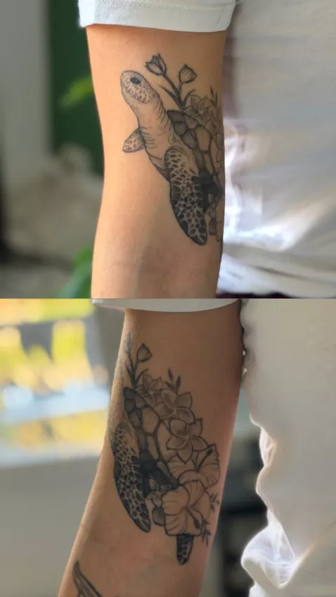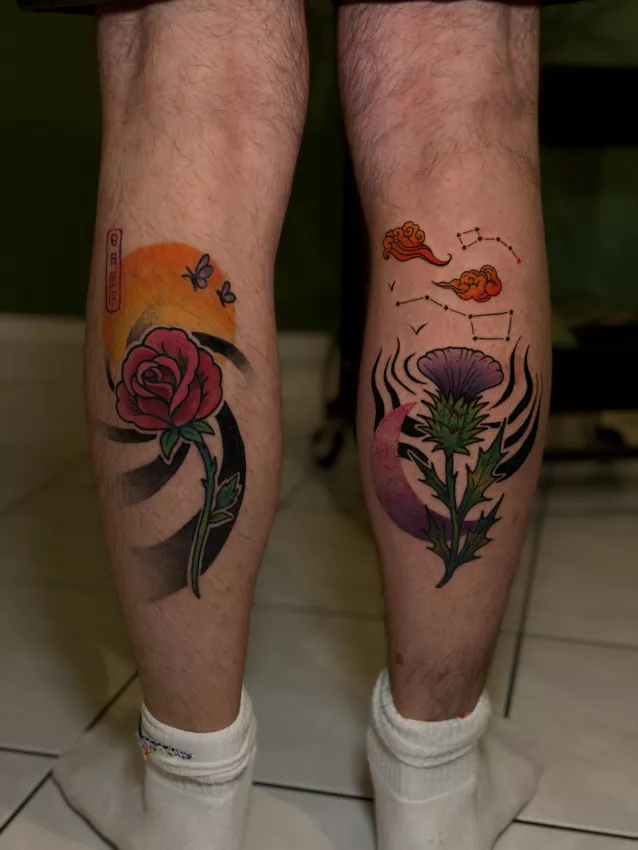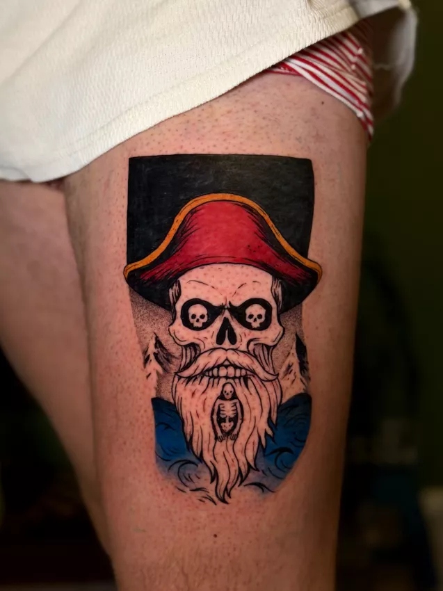
Neo-traditional is like the more dramatic cousin of old school. The one who kept the family's black outlines but shows up with gradients, an imaginary cape, three peonies, and a fox judging you. It keeps the structure. It adds cinema.
At the studio, it's often the style of people who want a visible, colorful, detailed tattoo — but not realistic. You want a vixen with peonies, a dark butterfly, a stylized portrait, a hand with a dagger and leaves? Then we're talking neo-trad. And we're also talking size, because none of that fits neatly into a postage stamp.
The Difference from Old School
Old school is simpler: thick outlines, limited palette, direct forms. Neo-traditional keeps that solidity but opens up the drawing. More detail, more volume, more colors, more nuance.
The result can be very powerful. But it also needs more space. A too-small neo-trad quickly loses its interest because shadows, textures, and details need room.
If you're torn between the two, also read the guide on old school tattoos. Old school is more frontal. Neo-trad is often more narrative.
Designs That Work Well
Floral is a classic. Roses, peonies, chrysanthemums, invented flowers, leaves, branches. Flowers provide movement and structure compositions well. The article on the meaning of flower tattoos can help choose something beyond a "pretty" flower.
Animal designs also work great: fox, snake, wolf, butterfly, bird, tiger, cat, insect. The style allows giving real personality to the subject. No need for realism for the animal to have presence.
Butterflies are especially well-suited. In neo-trad, they can become denser, darker, more graphic than in fine line. If you want to explore this motif, check butterfly tattoos.
Color and Contrast
Neo-traditional loves color, but not randomly. Too wide a palette can make the tattoo confusing. Better to use a few strong colors, well hierarchized, with black holding the structure.
Contrast is vital. A neo-trad piece must be readable from a distance. Details come second. If you only understand the design in a zoomed-in photo, the composition lacks a backbone.
Black isn't the enemy of color. On the contrary, it carries it. It gives weight, depth, and helps the tattoo age.
Placement and Size
Upper arm, forearm, thigh, calf, shoulder, and back are good grounds. Neo-trad likes areas large enough to let the composition breathe.
On a small area, you can do a simplified neo-trad design. But you'll need to reduce details, not just shrink the drawing. An animal head with three flowers, ten leaves, and jewelry in five centimeters — that's a no. Or a yes for creating a premium blob.
The body's shape should guide the drawing. A vertical piece on the forearm, a round composition on the shoulder, a large diagonal on the thigh: placement does part of the work.
Aging
Neo-trad ages well when it keeps solid outlines, readable masses, and contrast. It ages less well when it becomes too illustrative, too fine, too dependent on small lighting effects.
Colors can lose intensity over time. Sun accelerates the problem. A study on pigment photodegradation explains that light can contribute to the breakdown of certain colors: Photostability and breakdown products of pigments currently used in tattoo inks.
So yes, sunscreen isn't an obsessive person's detail. It's basic maintenance.
Who Is This Style For?
Neo-trad is perfect if you want a visible, decorative, expressive piece with real presence. It suits floral, animal, symbolic projects, and compositions with multiple elements.
It's less suited if you want something tiny, discreet, nearly invisible. In that case, better to go minimalist or fine line, accepting their limits.
Good neo-trad doesn't try to be shy. It owns it. That's why it works.
It also means accepting the drawing time. A neo-trad piece often needs more preparation than a simple small design: balancing masses, palette choices, shadow placement, hierarchy between main subject and secondary elements. If everything has the same importance, nothing stands out.
A good composition should be summarizable quickly: an animal, a flower, a direction, a mood. Details come after. Not before.
Key Takeaways
- Neo-trad takes the solidity of traditional and adds detail
- It needs size and contrast
- Floral, animal, and butterfly work very well
- Black helps colors hold visually
- Recommended cover: neo-trad floral or animal design, bold colors, 1200x630 framing
Neo-trad works when it keeps a backbone. Too many details without hierarchy, and you don't have a rich piece. You have a meeting of motifs all talking at once.