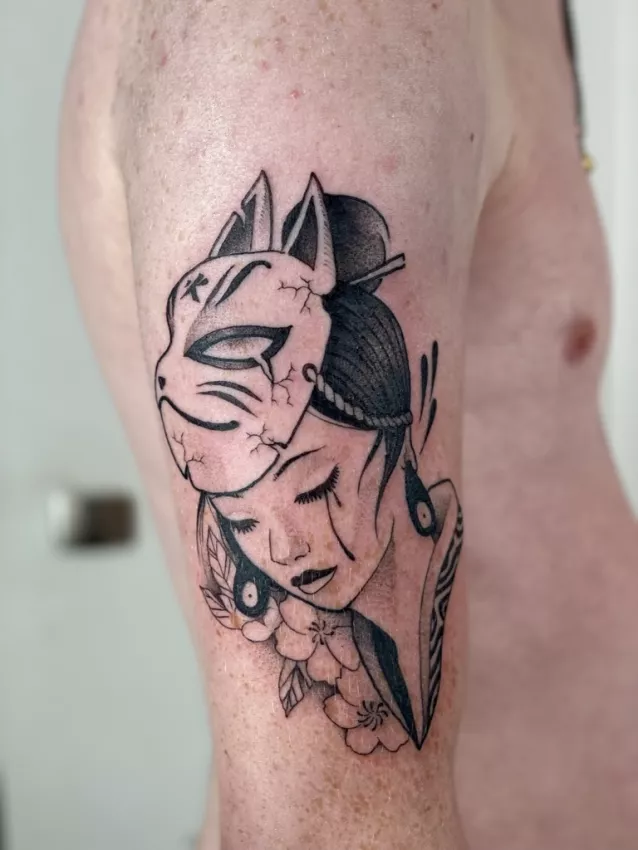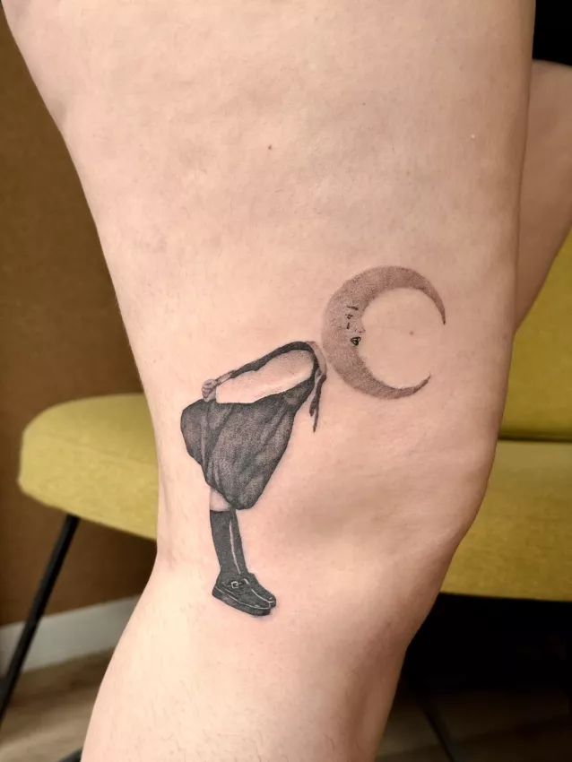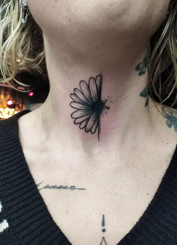
I've turned down drawings I genuinely thought were beautiful. Not "nice but I'm being polite" beautiful. Frame-worthy, notebook-worthy beautiful. And still — on skin, they wouldn't have worked.
This is a delicate conversation. Because the client sometimes hears: "your idea sucks." That's not it. I'm saying: "your idea deserves a better translation."
A tattoo isn't a print on paper. It's a living drawing, set into living material.
A drawing can be beautiful but unreadable
Beauty doesn't guarantee legibility.
An illustration can have fine gradients, tiny details, delicate textures. On paper, your eye can lean in. On screen, you zoom. On skin, at normal distance, everything has to hold.
A good tattoo must be understandable without a manual. Even if the style is abstract, it needs structure. Visual strength. Breathing room.
The problem often comes with busy designs: multiple subjects, lots of lines, low contrast. Flat, it looks interesting. On an arm, it becomes a mess.
In tattooing, empty space is a tool. Untouched skin helps the design breathe. Filling every inch usually kills readability.
Skin changes the rules
Skin isn't blank paper. It has grain, color, elasticity, folds, history. It heals. It moves. It ages.
A tattooed line isn't an ink line on paper. It lives in the skin. Over time, it may thicken slightly. Tight details can blur together. Contrasts can soften.
So a very fine, very dense, very small drawing can look stunning on day one and worse later. A tattooer has to think about that future.
It's frustrating sometimes, especially when the client arrives with a very specific image. But saying yes to everything isn't doing anyone a favor. A serious tattooer sometimes has to say: "Let's keep the spirit, but not this exact version."
If that logic surprises you, the article minimalist tattoos: small doesn't mean simple explains why a fine design often needs more room than you'd think.
Size decides a lot
People often ask: "Can we make it smaller?"
Smaller is rarely magic. It can make a project more discreet, sure. But it can also destroy its readability.
A portrait, a realistic animal, a full scene, a detailed bouquet, an ornamental piece — all of these need space. If you shrink too much, eyes become dots, fingers become lines, textures become gray dust.
On the flip side, some motifs look amazing small because they're designed for it. A simple silhouette. A clear symbol. A stylized flower. An efficient flash.
The problem isn't small size. The problem is a complex drawing forced into a small size.
Style must serve the project
A beautiful drawing can fail because the chosen style doesn't serve the subject.
Example: a deeply emotional idea can lose its power if treated with too many decorative details. An aggressive image can go flat if contrast is too weak. A symbolic motif can get confusing if you try to make it "realistic" for no reason.
Style isn't an Instagram filter. It's a construction decision.
Old school, fine line, blackwork, engraving, neo-trad, realism, minimalism — each language has strengths and limits. A good tattooer doesn't just pick what's trendy. They pick what will carry the project.
That's also why it's better to talk with your tattooer rather than order an exact copy. See communicating your project to a tattooer.
A flat drawing can sit weird on the body
A drawing can look great on paper and strange on a body part.
Why? Because a body isn't flat. A shoulder curves. A forearm has two planes. Ribs stretch. Knees bend. Hands move. Stomachs change.
A very rectangular composition can feel stiff on a round area. An overly horizontal image can look lost on a vertical limb. A centered motif on paper might need to shift on the body.
Placement isn't the last step. It's part of the drawing itself.
A good tattoo has to look like it belongs. As if it was designed for that person, that spot, that dynamic.
This work often starts with the first exchange. The clearer the brief, the better the tattooer can choose what stays — like in a real personal tattoo project, not a quick copy-paste.
Tattooing requires letting go
This might be the hardest part.
To make a good tattoo, you sometimes have to let go of part of the beautiful drawing. A texture. A background. A small inscription. A detail the client loves. A gorgeous lighting effect that's too fragile.
That's not failure. It's the price of a lasting design.
In this job, you learn fast that not everything should be tattooed as-is. Some images work better as illustrations. Others can become great tattoos after adaptation.
That's the difference between "reproducing" and "designing."
Bottom line: a good tattoo is an adapted image
A beautiful drawing pleases the eye. A good tattoo has to do more: it has to hold on skin, over time, on a real body.
It needs to be readable. Breathe. Accept its size. Respect its zone. Use a coherent style. Anticipate healing.
So yes — not every beautiful drawing makes a good tattoo.
But almost every good idea can become a good tattoo, if you're willing to rework it. Not to betray it. To make it tattooable.