I spent a long time drawing as if the world were flat. A sheet of paper, a tablet, a sketchbook. Then tattooing reminded me of a humbling truth: people have round arms, ribcages that breathe, shoulders that rotate, knees that bend. In short, the body doesn't always respect the layout.
Tattoo composition is the art of making an image live on a volume. Not just placing a design "somewhere."
Placement isn't a finishing detail
A lot of people imagine the process goes like this: you create the design, then you choose where to put it.
In reality, placement should come very early. Sometimes during the first conversation. Because the area changes the shape of the motif.
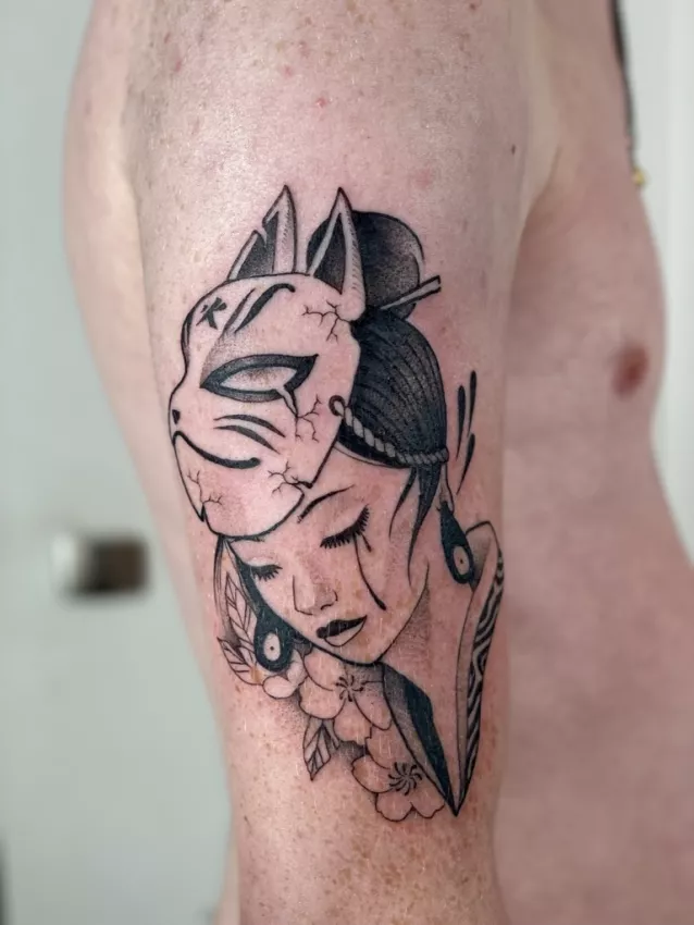
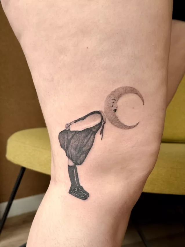
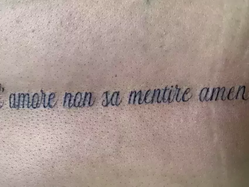
A forearm often calls for a lengthened composition, or an image that wraps well around the volume. A shoulder can welcome a rounder shape. Ribs mean thinking about verticality, breathing, and also pain, let's be honest. A thigh offers space but imposes its own curve.
Placement decides size, orientation, detail level, sometimes even the style.
A beautiful drawing in the wrong spot can feel glued on, foreign, awkward. A simpler design well placed can feel obvious.
If you're preparing a first project, this ties into a lot of the zone and comfort questions covered in first tattoo in Grenoble.
Body movement guides the design
A tattoo is almost never seen still in perfect conditions. You see it when the person talks, walks, reaches, sits down, turns around.
Movement changes how you read it.
A line can follow a muscle. A composition can follow a natural curve. A motif can reveal itself gradually when the arm turns. Or it can visually break if it completely ignores anatomy.
This isn't a mystical rule. It's observation.
On an arm, a too-frontal composition can work in photos but lose its strength in real life. On a shoulder, a motif can gain a lot if it follows the roundness. On a leg, verticality can give a strong presence.
The tattoo artist isn't just drawing an image. They're drawing a relationship between image and movement.
Readability: the silent judge
Readability is a less sexy word than "style," but it matters enormously.
A readable tattoo isn't necessarily simple. It can be rich, detailed, subtle. But it needs a clear hierarchy. The eye needs to know where to look.
In a good composition, there's usually a main subject, secondary elements, breathing room. If everything shouts at the same volume, nothing gets heard.
It's like music: if every instrument plays its solo at the same time, it gets exhausting. In tattooing, if every detail wants to be important, the design becomes flat.
Readability comes through contrasts, sizes, spacing, mass, empty space. It also comes from the courage to remove.
That's why a very detailed motif sometimes needs to be enlarged or simplified. Same logic as in minimalist tattoo: small doesn't mean simple, except here we're talking about overall composition.
Available skin isn't always ideal skin
A client might say: "I have a spot here." Fine. But is that spot right for the project?
A wide design in a narrow area can feel cramped. A vertical composition on a too-short zone can get compressed. A very detailed design on an area that moves a lot can age less well.
Sometimes you need to change the area. Or change the design. Or accept that the project needs more space.
That's a normal conversation. It's part of the job.
A tattoo artist who suggests a different area isn't necessarily trying to make life hard for the client. They're often trying to save the project.
Composition needs to think about the future
A tattoo can be alone today and surrounded tomorrow.
Some people want a standalone piece. Others build a sleeve, a leg, a progressive collection. In both cases, the composition needs to plan ahead at least a little.
A design too close to a joint can block future extensions. A piece placed without logic can make the next steps difficult. Conversely, a well-thought-out composition leaves doors open.
You don't have to plan everything ten years ahead. Nobody always knows where they'll be. But keeping some coherence helps.
This is especially true for big projects. Before starting a large area, it's better to have an honest conversation about style, rhythm, transitions, and fill level.
And if the idea is still fuzzy, better to say so rather than pretend to have a perfect plan. The article communicating your project to a tattoo artist is exactly for that.
Perfect photo vs. real life
Instagram has a flaw: it often shows tattoos at their best moment. Controlled lighting, flattering angle, fresh skin, tight crop.
Real life is less polished. The tattoo has to work under a half-rolled-up sleeve, in a bathroom mirror, in full sun, on healed skin.
A successful tattoo composition doesn't depend only on the day-one photo. It keeps its presence in everyday life.
That's why placement and readability choices matter more than they seem.
Conclusion: composing is respecting the body
Tattoo composition isn't a decoration placed on a neutral surface. It's a negotiation with the body.
Placement, movement, readability, size, future, style — it's all connected.
A good tattoo feels natural, even when it's highly worked. It gives the impression of belonging. Not because it landed there by chance, but because someone thought about the area, the volume, the gaze, the time.
And when it's done well, the body doesn't endure the design. It wears it.